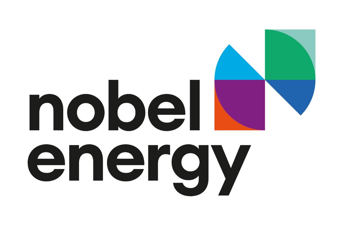
The logo
The logo embodies the transition in the energy sector — from fossil fuel energy, represented by orange, to cleaner energy, in blue, through sustainability, symbolized by purple. The ultimate target is green, renewable energy, supported by innovations represented in dark blue.
Innovation, a core part of the Nobel brothers’ legacy, also reflects the brand’s Explorer archetype, highlighting an innovative approach to business through investment in people.
The logo mark also symbolizes the letter ‘N’ (for Nobel) and a windmill — representing resilience and sustainable energy. The combination of various shapes in the logotype reflects the rich and diverse portfolio of Nobel Energy Group.
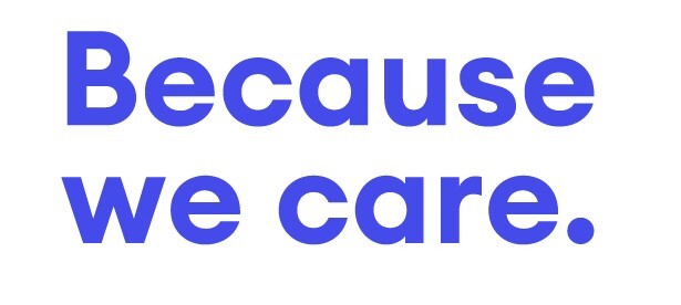
The brandline
The Nobel Energy brandline reflects all our brand archetypes – Caregiver, Sage and Explorer. It builds on the Nobel Family’s heritage, which underpins their focus on people – their safety and well-being – and ensuring sustainability through innovative solutions.
The brandline underlines Nobel Energy’s approach to both business and the sustainability of resources. Every client who trusts us their business deserves to know: why Nobel Energy? And the answer is straightforward: Because we care. We are committed to jointly writing the success stories of our customers by providing the best expertise and integrated solutions required to achieve safe and efficient results.
Our intention and promise to join the ‘green train’ has a purpose: Because we care. We are committing to environmental sustainability by adding a new, green segment to our portfolio and undertaking other low carbon interventions.